In a constant state of flux
As soon as I joined the Animation Lab at the University of Utah Department of Biochemistry in early 2019, Janet Iwasa, the head of the lab, challenged me to visualize the flow of metabolites. Although metabolic flux was unfamiliar territory, the biochemist in me leaped at the opportunity.
A subset of biochemists studies metabolic flux, tracing metabolites through biochemical pathways in our bodies; how they travel through these pathways can change as conditions change, especially during disease. Although mathematical tools exist to compute flux and visualize it in the context of complex pathways, there is no simple way to visualize metabolites’ dynamic journeys intuitively. Greg Ducker, one of our scientist collaborators who studies flux, emphasized this. Ducker and Jared Rutter at the University of Utah School of Medicine were interested in visualizing how flux changes during cancer. Thus began my own journey to imagine a way to do that.
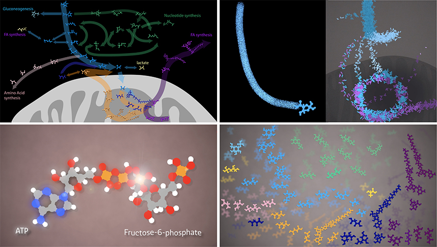
For a couple of months, some questions floated around in my mind: How do I represent metabolites? How do I depict cellular compartments? How do I show flow — would trails be formed by the metabolites? Should I make the pathways random, as they are in reality, or should I follow current conventions? For example, should I use a circle to represent the tricarboxylic acid cycle, something biochemists are already familiar with? I wanted to keep the audience in mind and consider what would be most intuitive or useful to them. That was a challenge.

Change in flux
And then we were enveloped by the pandemic. I began to see COVID-19–related data visualizations in public media. The New York Times came up with a remarkable visualization showing the flow of infected people from Wuhan, China, to neighboring countries and other parts of the world.
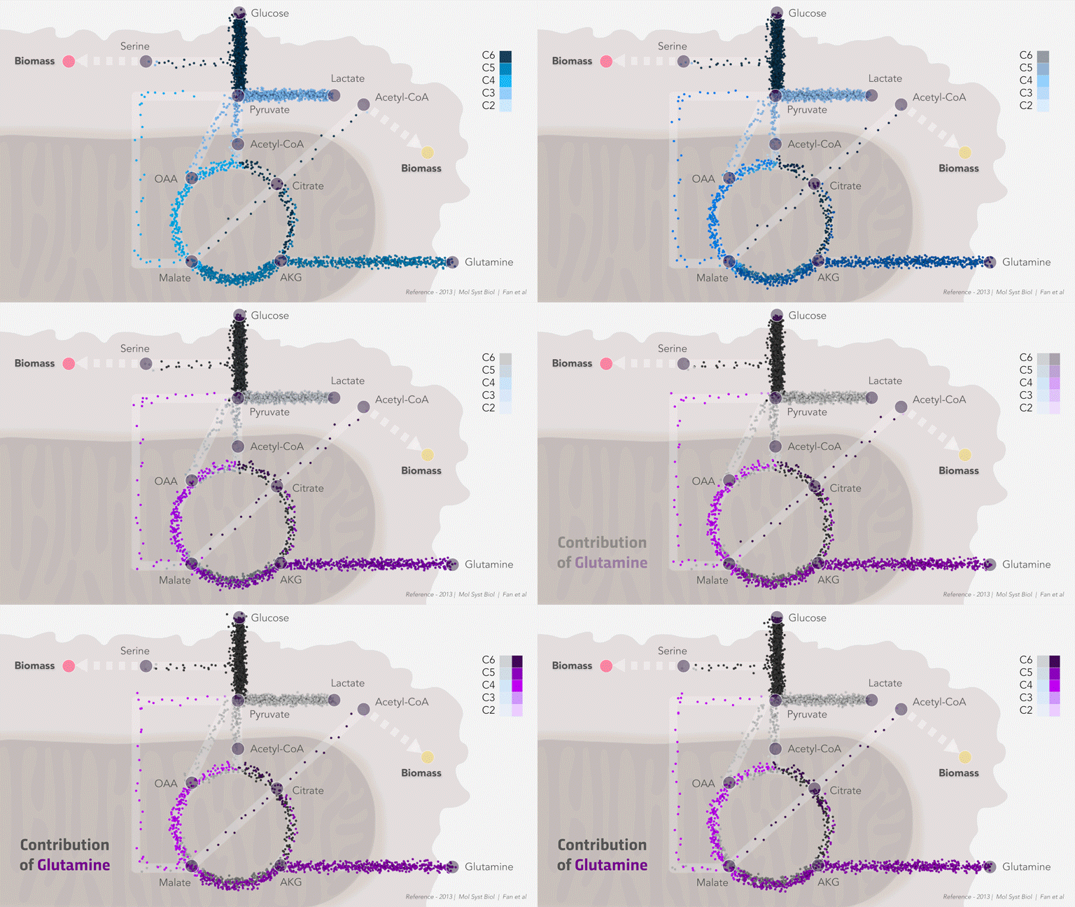
Naturally, I envisioned carbon from glucose moving from outside the cell to different compartments or through various pathways. I was inspired to revisualize and use roads as a pathway guide to the viewer. This was not a new concept; metabolism educators often use Google maps and traffic to convey the concept of flow of metabolites through networks.
I developed a pilot animation of carbon flux through the central carbon metabolic pathways using flux data from published research. I excitedly presented it to our scientist collaborators. However, we soon realized this might not be useful to them if they are unable to customize flux input and pathways for their own research study. But could it be used to teach the concept of metabolic flux to trainees and students?
Thus was born the idea of a short lesson around this animation: “The Journey of a Metabolite.”

Flux can go both ways
We harnessed the power of social media — Janet Iwasa’s Twitter community — to find potential educator collaborators who would provide input on the lesson. We received an overwhelming response and realized that science instructors need reimagined visualization in metabolism. A group of talented and driven educators of undergraduates exposed me to the world of teaching and suggested that we include instructions to educators, add illustrations of a few individual pathways before showing an integrated view with all pathways, connect the material to examples used in classrooms and make sure not to overwhelm students with complexity. I realized that we were only scratching the surface.
Metabolic flux is part of undergraduate biochemistry instruction only in a few isolated cases, perhaps dependent on the instructor. It may be more accessible in institutions that have active flux research infrastructure. I was not exposed to these concepts as a student, and I now believe this fundamental topic could enhance any student’s systems-level understanding of metabolism and biochemistry.
In its initial release, the lesson provides an introduction to metabolic flux via several animations. Through five modules, a student can learn:
- The concept of flux.
- How carbon flows through common metabolic pathways such as glycolysis, fermentation, the TCA cycle, the malate-aspartate shuttle, citrate to fatty acid synthesis and the pentose phosphate pathway.
- How these pathways in central carbon metabolism are interconnected.
- The alteration of carbon flux under conditions such as hypoxia and cancer.
- How one can measure flux in a lab.
Each module includes instructions for teachers on how to weave these visuals into their biochemistry and metabolism classes, questions for further discussion, and resources to dig deeper in case of piqued curiosity. We hope this free visual lesson can be a valuable supplement to any biochemistry teacher’s instruction materials worldwide. We plan to conduct a modest evaluation of our lesson this fall. Explore the lesson here.

To be in a state of flux
Although reimagining education has been a trending topic for a couple of years, the COVID-19 pandemic may have accelerated this process. Researchers and educators have been forced to think how they can use rapidly evolving technologies for learning and student engagement when students are not in the classroom or lab.
Visual lessons such as the one we have developed can be incorporated easily into hybrid learning models (a mix of flipped, blended, remote, distance and online learning). We as scientists, educators, and teachers need to be flexible and adaptable. We need to re-think meaningful ways to deliver important and difficult science topics to trainees so they continue to comprehend and be inspired and engaged.
Enjoy reading ASBMB Today?
Become a member to receive the print edition four times a year and the digital edition monthly.
Learn moreFeatured jobs
from the ASBMB career center
Get the latest from ASBMB Today
Enter your email address, and we’ll send you a weekly email with recent articles, interviews and more.
Latest in Opinions
Opinions highlights or most popular articles

Mentorship and uncertainty: Lessons from Telemachus
A biochemistry educator reflects on mentorship through the Greek story of Telemachus, showing how embracing uncertainty, failure and curiosity can transform teaching.

Embracing the twists and turns along the educator pathway
A biochemistry educator reflects on the challenges of early faculty life, describing how evidence-based teaching, cross-disciplinary collaboration and classroom challenges shaped her growth.

Redesigning with students in mind
Assistant professor reflects on how the shift to online teaching revealed gaps in points-based grading and led to a redesign centered on transparency and student growth.

Teaching beyond information transfer
Educator reflects on moving beyond lectures to create a biochemistry classroom centered on engagement, transparency and student ownership, showing how small shifts like “student hours” and active learning can transform understanding.

Mayday! Lessons from cellular dysfunction and group work dynamics
An upper-level biology course revealed that strong science doesn’t guarantee strong teamwork. One instructor shares how failed group dynamics reshaped their approach, leading to more structured, collaborative and effective student learning.

Showing students that it’s OK to ask questions
Assistant professor reflects on how admitting uncertainty and following student questions beyond the syllabus reshaped classroom culture, encouraging curiosity, vulnerability and deeper engagement in introductory biology.

