Pixel perfect

When the results started rolling in and a story began emerging, my thesis adviser usually instructed us to start assembling figures for a paper. At first, it was daunting to see blank figure panels nestled between the data we had. But the process made it easier to identify missing experiments and to see the logical progression of the story as the holes started to fill in.
With so much attention focused on building a scientific argument, the last thing on my mind while assembling figures was the final figure resolution. However, forgetting to keep resolution in mind from the start can cause problems later on. To avoid any potential issues down the road, I offer a few tips.
Let’s start off with some basics. When reading submission guidelines for journals, they often throw around terms, such as “minimum resolution,” “dpi,” “ppi” and “vector graphics,” which all seem irrelevant when you are eager to write up your manuscript. So what is a pixel, the first “p” in “ppi”? A pixel, derived from “picture element,” refers to the most basic unit composing an image. Each pixel contains information telling the computer what color or shade of gray to display. The film you have scanned, the immunofluorescent image you’ve snapped or the Western blot image you’ve exported from an imaging system — that image is composed of many pixels arranged in an x, y grid such that the final image will show coimmunoprecipitation of your protein of interest or mislocalization of your protein upon treatment with an inhibitor.
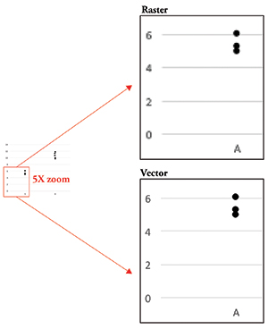 Figure 1. Raster data vs. vector data. Raster data becomes pixelated as you zoom in, whereas vector data remains clear.
The resolution of the image refers to the density of pixels. It is the number of pixels that make up your image. The greater the resolution, the more information an image contains and the clearer your image will be. This quantity is expressed as pixels per inch, or ppi. For publication purposes, most journals will require that you submit your final figures with a minimum resolution of 300 ppi. You often will see dots per inch, or dpi, used interchangeably with ppi, but dpi actually refers to printer output, or how many dots of ink are found per inch of a printed document. Since we are talking about digital images, ppi is the more relevant term to use.
The last bit of information you need to know is that your image data can be either raster or vector data (Figure 1). Raster data is simply an image made up using pixels as building blocks as discussed above. Vector data, on the other hand, is not composed of pixels but rather is a set of instructions that tells the computer to display lines and curves. This type of data is useful for graphs or models, since it remains smooth no matter how much you zoom in. Conversely, raster data becomes pixelated as you enlarge the image, making the gridlike pattern of pixels obvious.
OK, we’ve got the basics. Now how do you apply this information to create awesome figures?
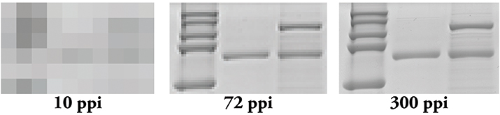 Figure 2. Resolution matters! Even if you scan your film at 300 ppi, if you use PowerPoint, you effectively are changing it to a 72 ppi image.
Tip 1: Remember that figure preparation begins at data acquisition. Make sure you are acquiring your image at the proper resolution. Whether you are scanning a film or exporting a file from an imaging system, keep the minimum resolution of 300 ppi in mind. It’s never fun when you realize that you have to find a particular film to rescan at the proper resolution months (or even years) after you performed the experiment, or worse, conduct the experiment again if you can’t find it. For graphs, make sure you are exporting the data in nonraster format, such as *.pdf, *.eps or *.svg. Exporting in these types of formats will prevent your graphs from looking pixelated and keep text legible no matter how you resize it later.
Tip 2: Use appropriate software when laying out your figures. PowerPoint may be user-friendly, but it is meant to work at screen resolution, which is only 72 ppi. When you export images from this program, you end up with a 72 ppi image that needs to be converted into a 300 ppi one (Figure 2). Conversion to a higher resolution image can result in an image that is too small for publication or one that is extremely pixelated. Additionally, depending on how you upscale, or increase the number of pixels in your image, your software program may introduce pixels into your image, thereby creating artifacts. Adobe Illustrator usually is recommended for figure assembly, but Inkscape and CorelDraw are good alternatives. These programs are meant to combine raster and vector data into a single figure and can do so without affecting the pixels found in raster data.
Tip 3: Set your canvas size to the physical dimensions provided by the journal. Most journals provide two or three size options: single-column width, double-column width and occasionally 1.5-column width. Once you insert your graphics into the figure using the appropriate software, you usually don’t have to worry about image resolution; however, be careful when increasing the size of a raster image. If you insert a 300 ppi image and decide you want to double its size, the resulting resolution of that image will be 150 ppi and likely will look less clear than the original.
Keeping track of image resolution shouldn’t be a hassle. By incorporating these suggestions into your workflow, you can rest assured you have done your due diligence.
Enjoy reading ASBMB Today?
Become a member to receive the print edition four times a year and the digital edition monthly.
Learn moreGet the latest from ASBMB Today
Enter your email address, and we’ll send you a weekly email with recent articles, interviews and more.
Latest in Science
Science highlights or most popular articles

Fat synthesis enzyme crucial for milk fat and newborn growth
Researchers found that a deficiency of the fatty acid synthesis enzyme stearoyl-CoA desaturase-1 reduced mammary gland function during lactation and caused low birth weight in newborns that were fed milk from enzyme-deficient glands.

Flipping lipids and slime molds
A dull first job nearly pushed JBC associate editor Todd Graham out of science. Then a slime mold project changed his path. Now, he studies membrane biology and reflects on discovery, persistence and mentoring through uncertainty.

How smelling death alters worm behavior
Researchers have found that the roundworm C. elegans can smell death, and it changes how the worms behave, reproduce and age.

A chance encounter with the lab
Payton Stevens never planned to become a pancreatic cancer researcher. A temporary job set him on a path from rural Kentucky to leading research on Wnt signaling and metastasis, where he now pairs discovery with mentorship and science advocacy.

Light-activated small molecule could transform eye infection treatment
Contact lenses raise the risk of infectious keratitis, a leading cause of blindness worldwide. A biotech company is commercializing a light-activated therapy using a ROS-generating molecule to rapidly kill microbes in the cornea to preserve vision.

The molecular orchestra of memory
Calcium, calmodulin and calcium/calmodulin-dependent kinase II form a molecular axis that turns fleeting neural activity into lasting memories. New research shows how memories are stabilized, and possibly even protected or repaired.